Quantcast
Channel: Design With Christine
Viewing all 132 articles
Browse latest View live

Giao's Exterior

$
0
0

Hi Christine,
I'm really enjoy reading your Blog and hope you can give me some advice on paint colors to warm up my house. I have been looking for exterior colors for almost two months and bought over dozen paint samples, but nothing seem to work. Either the color is too beige, too dark, too light, too taupe, or too grey. I want the colors to compliment the brown roof and dark cherry red brick. I like to keep the trim white to match with vinyl windows. I also like to use Sherwin Williams paints.
Here is the picture of my house. Thank you so much for your help!


Best regards,
Giao


Hi Giao,


With your red brick, I'd go one of two ways.  Green or dark.


First- green.  Red and green are complimentary colors.  They make each other look better and truer.    

The second direction I'd consider is using a darker color.  Your brick is also dark, which is what might be making some colors look too light and disconnected.  You mentioned that some colors you considered were "too dark".  Perhaps that is just a matter of not being "used to" the darker look. 

With a house like yours, with the garage the focal point, I would consider getting fantastic garage doors. 


As your garage is now, I would not paint it two-tone, like it is currently, keep it all one color- the field color of the house. 


Curb Appeal for Christine

$
0
0


Dear Christine, this is Christine from Royal Oak, MI. My husband and I are in the process of redoing our ranch-style home and purchasing new windows, new garage door, entry doors (side and front) and possibly a new roof. This is a big deal for us financially, but we are taking the plunge and going for it! We need your help! We cannot decide what we should do with the siding due to our small ranch-style home already having half brick and half siding. I am soooo unhappy with the blah look and the blah curb appeal that my home has to offer.


I'm ready for a CUTE COTTAGE look that catches the eye. Possibly cedar shake, cultured stone, some added wood trim??? I am open to ANYTHING! We have a detached garage that is fully sided (no brick), but the front of the house is the main challenge (half siding/half brick).


We thought possibly cultured stone or cedar shake in the main front, and siding for the side and garage, but I need it to all come together and flow. I want CUTE! We already have/and are again getting the crossbar windows that look cottage cute, but the color of the siding, the front "pop" idea and the flow is the issue. Please give me your honest opinion. Please know that I realize it looks awful right now, this is where I'm praying you will give me ideas and insight. I just found a way to send you pix :)
Please see the other 2 emails following this one which will include add'l views of my home. We will be forever thankful if you would be willing to take on our challenge.


Hi Christine,


How exciting to be making big changes to your home!  I would focus on three things to create a more charming cottage feel.

  1. Larger windows.
  2. Stronger entrance.
  3. Architectural detail.

  This window is all wrong: I know that sometimes I give advice when only seeing the exterior, and it might be completely impossible if I could see the inside.  For example, I would say this window is too small, too short, too awkward.  Maybe it is over an important kitchen counter and can't be any larger, but I would do my best to make it larger.


I know it gets expensive to add a covered porch, but your current roof line is so lacking in character- it's hard to make the house look truly cute and charming without changing it.  I would make your front steps about 5x wider than they are now, and add a little porch off to the left with a pediment over the entry, sidelights adding bulk to the door, and increase the window size on the far right.


I did a little cut and paste to make some changes for you. 


I hope my choppy cut and paste gives your the feel I'm hoping it does. 


XOXO

Christine

Emily in Rochester

$
0
0

Hello Christine,

We are really struggling with exterior color choices for our home.  The biggest challenge is our windows are tan.  So a traditional cape cod with dark gray siding, white trim, and black shutters just doesn’t work (as the previous owners I think tried…but now the home just looks confused).  We are leaning towards a gray with more beige undertones for the siding.  Also we plan to paint the trim and facing to match the window color (or maybe a shade lighter and more creamy white).  But we would love your advice.  I really liked your previous post to Megan from Nebraska (http://www.christinefife.com/design-with-christine/2015/5/5/megan-from-nebraska.html), but I don’t know if those same colors will work with our tan window color—and we don’t want to paint the windows or replace them for a while.  
If you have a moment to think about accent colors, we also need to decide about shutter colors (or just removing them since we only have a couple), and the front door.  We definitely don’t like the two-tone door and black that makes the door recede instead of being welcoming.
Thanks!
Emily from Rochester NY
Hi Emily,
Yes, the colors in the post you mentioned would work just great.  Let me mention a few things that will enhance the look.  The proportion of your field color to your trim color is a little weak.  Exaggerate your trim size a bit and you will be much better off. 
1.  The size of the frieze board.  See this board running parallel with your roof line?  It's a little small. 


Compare your home to this one:

Larger trim/frieze board makes your color pop. 


2.  I like the idea of the shutters, because it is giving the field color to trim color a much needed boost.  However, what I don't like is the view from the front of the home with just one shutter showing, and it being so bold, it stands out (not in a good way) without having repetition.  I would increase the size of the window, remove the shutters and also add an additional horizontal frieze board over the garage area. 

If that's more of a project than you want to take on, I would use a more subtle shutter color- like in the photo below:


On second thought- I would do both.  Increase that small window size, AND use a subtle shutter color.

3.  I would also increase the size of the trim throughout on all of the windows.


4.  Notice how in the photo below the bay area is entirely painted in the trim color.  It really should be all trim, with no horizontal siding in this area.  That is also how yours should be.  Yours might be like that- the picture is not clear enough forme to be able to tell. 

5.  I would also change the roof over the bay window to a copper roof. 


6.  I agree with you on the front door.  It does look like the black hole.  A bright red would be great. 


Only paint the door in red, the side lights and trim in the off white trim color.  While I was cutting and pasting, I went ahead and replaced your garage door.  ;-)  If the garage door is pretty- like the one below- have it be in the trim color- as long as you keep your current one- have it be in the field color.  Contrast draws attention.  If you don't want attention drawn to something, have low contrast.  If you have something lovely, increase the contrast.


Good luck with your painting!


XOXO

Christine

Options for Stephanie

$
0
0

 Hi Christine,

Our family recently moved and were given the opportunity to choose a new exterior house color while we were away on vacation.  We mistakenly chose the color using only a photo of the house and the Sherwin Williams app.  We regret it terribly!  The color is SUPER BROWN! (body- Meadowlark and trim-Chopsticks by Sherwin Williams)  Our biggest concern when choosing a color was choosing a color that would go well with the rock front of the house, and that is still our biggest concern.  We have considered Sherwin Williams’ Loggia (body) and Natural Choice (trim), but we are so afraid of making another bad choice!  We want to go more to the gray end of the spectrum if possible while still complimenting the rock which seems to have a lot of reddish clay-like undertones. The interior of our house is light, bright, and airy which we love!  We love soft grays and whites, just to give you an idea of our taste.  Could you PLEASE give us some advice?!  It would be greatly appreciated!  I have included two photos.  Please let me know if it’s too shadowy.  I can take more photos and resend if needed.  Thank you so much!    -Stephanie+


 Hi Stephanie, 


With your stone, I would go one of two ways.  A light cream color, like China Doll, or a dark gray, like Cyberspace. 


Beware of the trendy lighter gray colors.  Your stone is simply all wrong for it.  A traditional light off white like the two photos below, would work very well.  If I went that way, I'd keep my shutters off white as well. 


On your front door, I'd go dark gray or black.   Off white might not sound exciting, but as you can see in these photos, it is a lovely combination with stone very similar to yours.  Check out the photo below, where the terra-cotta color of the stone is accented in the plants, and the paint is kept very simple. 


Can you go gray?  Yes, but, not light gray.  Your stone is asking for a dark gray compliment.  I couldn't find a photo showing your stone color with a dark gray home, so please forgive my cut and paste, but I cut the stone off the front of your home, and pasted it on a home painted in Cyberspace by Sherwin Williams.  Accent in off white and black.  What do you think?  Should Stephanie go off white or dark gray?


SW7076 Cyberspace

Sue's Exterior Dilema

$
0
0

Hi Christine,

I recently had my Tudor colonial stucco and wood trim colors repainted.

I do not like the results!

The house just has too much going on. So, I "washed' the brick with the stucco color (SW Bunglehouse Gray) and like that it helped to tone down the brick. I feel that the brick does not match the roof and am not opposed to painting it a solid color if you think that will help.

I do not want to spend the money to redo the whole thing, and am hoping you can help! (Can you help pick a new wood trim color to match the Bunglehouse Gray?) The wood trim color is SW Enduring Bronze.

I do not like the traditional brown and white look of a tudor home.  I would love to lighten the whole thing up and am not against going even lighter with the wood trim (SW Universal Khaki)? I would also like to downplay the tudor features by using low contrast colors or even one color for both.

I painted the door BM Blue Note and like how it matches colors in the roof, but am not sure how this coordinates with everything else going on.

I soooooo appreciate your advice! Let me know if you can salvage the mess I have going on or if you think I need to start all over!


Sue


Sue, Sue Sue Sue....  What condition is the roof in?  I really don't love the roof with the brick (or the trim color) but that's hard (expensive) to change.  When you are ready to change the roof, go with a cooler, more of a chocolate brown, not the warm red brown.   Or- you can go with a lighter shade- like this roof:


In the meantime...stay away from Universal Khaki- it has green in it, and red and green, as opposites, will make each look stronger.  Translation- it will make your roof look redder- even worse with the brick. 


You are on the right to track to have a more subtle contrast if you want to downplay the half timber construction.  To not make me crazy, you should also keep the trim color darker than the field color- you can just make it less dark than what you already have.  If you have read my blog, you know that I feel strongly about staying true to the historic idea of half timber construction- and have the stucco lighter than the trim. 


A few ideas- #1- go to your local Sherwin Williams and ask them to make the Bunglehouse gray darker- perhaps add some black to it.  This would keep the difference very subtle.  Let them know that you want it to be not too dark- about as dark as these:


6172 hardware

7053 adaptive shade

7032 warm stone

7039 virtual taupe


These colors above are also some trim colors you could try samples of. 


Check out this house: 


Look how subtle the trim color is compared to the stucco- yet still darker- that is what I am suggesting for you.  However, your stucco is a lot darker than this- so overall it will look different, but you can still have the same level of subtlety. 


Now for your blue door.  I'm sorry- I don't like it.  It is too disconnected with the house.  Blue doors don't belong next to brick- they belong next to white siding.  I'd go either black, natural wood, or a light neutral (white would be too stark).  I'd try a sample of techno gray SW 6170 for a lighter painted door.  The columns and balustrade are techno gray in this photo: 

Good luck Sue- I'm sure you'll do a great job. 

Allyson's Exterior

$
0
0

Dear Christine,


I am completely overwhelmed!  I have a red, orange brick that I am trying to complement with new exterior paint colors.  Thinking of BM briarwood for siding, Revere Pewter for trim, Britannia Blue for the door and Westcott Navy for the shutters.  I also have vinyl, white windows that tend to stand out a bit.  Any advice would be greatly appreciated!  Have a great day!


- Allyson


Well Allyson,


Is it just me or is everyone painting their house the color the Restoration Hardware showroom?  Sometimes it is a great selection.  There have been posts where I have suggested very similar colors- but those clients did not have a beautiful brick house like you do.  You might not like what I have to say- but you can totally ignore it if you'd like.  You have a classic brick home, and have selected a super- trendy color pallette.  I would not do that.  This might sound boring to you- but this is how I would paint your house: 


Anyone recognize it?  It's the "Home Alone" house.  (It's almost October- I'm getting into the Christmas spirit).  Rich black shutters and door with white trim. 


This is an idea of what brick looks like with blue shutters and door: 


Do you sometimes have to stare at a photo and wonder if you like the combination? A really great combination does not require that.  Personally, I don't like the blue.  I don't like brick with brighter blues or grayer blues, or anything.   If you like that- by all means do it- but if you want my opinion- I'd go black. 

 I like blue shutters with a white or gray home, just not a brick one. 

Now- here's brick with a neutral gray like you selected: 


Is it hideous?  No.  But to me- this is so much prettier: 


I like the sharp contrast.  White or cream?  Go off your window color- it looks more white to me.  Your door can go white or black or white door trim and black door.  I'd have my black be much deeper than your current color of shutters.  Make it a sharper, richer contrast. 


There are a lot of people that might disagree with me and think I am "boring"- and if you do- please comment- tell me all about how dull that sounds to you.  ;-) 

Darla's Exterior

$
0
0

Dear Christine,

We live in a double wide home and it is straight across the front with a built on porch. Right now the trim and metal roof is white and the body is a butter yellow. I like the grey/tan color but not sure what is the best color to go with. Would like to add shutters and paint the front door. Do you recommend painting the underpinning the same as the house or leave it white? It is nothing fancy. I like the farm/cottage look. Need help please painter is coming tomorrow to start getting the house ready. Thank you!

- Darla

Hi Darla,

The secret to your place looking better is in the porch.  I would build a wide (as wide as the house) porch, with a balustrade, thicker supports, and your idea of adding shutters is a great idea.  Buy a new door, the nicest you can afford; it makes a big difference.  After that, a little grass and wider finished walkway and you are set.  I'm in California, and everyone's front yard is brown and dead, so your front lawn makes me feel right at home.  Maybe the drought will end soon.  ;-) If you want to elongate your windows, you can add window boxes.  Also- notice how much wider the entrance is in my photo than the original.  It is a richer look to have that width. 

Oh yeah- you asked me about the color, huh?  With that light roof, I'd keep it white.  My photo has a red door, but you really could do any color you wanted on the door- blue, green, turquoise.  Let your door express your personality.  (that advice was for Darla- not you folks out there with the brick houses)   ;-) 


Look at that- with a little photo manipulation, your double wide now looks like a charming estate. 


Thanks,
Christine


The Christmas Bedroom Reveal part 1

$
0
0

For Christmas this year My husband and I are re-doing our kids' bedrooms.  They are both ready for a new look.  My girls have outgrown their pastels and my boy's room never got the love that an interior designer mother should have given it. 

Today we broke the news to the kids that the boys and girls were switchning rooms.  I have some good reasons, but I knew that the boys would be upset.  They are moving from the large room to the smaller room.  Don't you hate it when one bedroom is clearly superior to another?  What is a parent to do? Pick their favorite child? One bedroom is larger and has a better window and a better closet.  Aren't architects parents? 

Needless to say, they WERE upset.  My little guy, Lincoln was totally crying.  I tried to explain to him that I was going to make his room awesome.  I asked him, "Do you know what your mother does professionally?"  Lincoln angrily responded, "She's a BAD interior designer!"  Ignoring the insult, trying to explain that I was uniquely capable of great things, I asked, "Do you know what interior designers do?"  To which Lincoln said, through his tears, "Ruin children's lives!"

I'd better make this good, or we are seriously going to have the worst Christmas ever.  I moved the kids to the bonus room for the rest of the month.  Their bedrooms are off limits, until Christmas day.  I'm quite certain that none of them read my blog, so I will keep you all updated here.  ;-)  Today we painted over a super cute mural that my mom did when we moved in.  I always wanted to add wainscotting below it, and we never did, which in turn always made me crazy at the "unfinishedness" of it all- but here is the "before" pics of my girls, "will be boys" bedroom. 


The mural was really hard to cover- but thank you Steve!  He did it.  We didn't worry so much about the one wall, I have other plans for it, and it didn't need to be perfect.  I'm trying not to be sad at the loss of the mural... 

Today's "after" pic.  It was hard to photograph, because the beds are in the center of the small room.  We have a long way to go!

I used a bright white, Snowbound, from Sherwin Williams on the wall.  More to come... 


The Christmas Bedroom Reveal part 2

$
0
0

So far I have done a ton of work and have little to show for it in pictures.  In the "will be boys'" room, we finished painting, and then on the far wall we flattened the texture.  My friend Nancy and I thought we'd take this on, as Steve was simply not making enough progress fast enough for me.  I bought some spackle, thinned it a bit, made a horrible mess troweling it on the wall, ruining my pedicure, let it dry, sanded the next day, which I found out the next day causes cancer, so- don't try that at home.  Still, the wall is just white, Stephen then primed it, very smelly job, still, no picture for the blog, still a white wall. 


Then I moved the contents of their closets.  If any local friends want some little boy toys, let me know, I have some purging to do.  How many race tracks do two boys need?  The girls' closets contents are in the boys' closet, and vice versa. A crazy un-fun job, still- nothing exciting enough for a blog post. HGTV leaves out the hassle of moving the stuff.  It is just as intrusive as actually moving to a different home.  They leave it out no doubt because it is super boring hard work.


Did I mention we are changing the trim?  Any regular reader of my blog knows I like large trim, and hate wimpy trim.  We had re-done the trim throughout the house years ago, including my office, master bedroom, etc., but hadn't gotten to the kids' bedrooms.  Steve has been removing and replacing 3.5 inch baseboard with 9" base in the bedrooms.  Of course you can't do that without replacing door trim, etc.  On Saturday, while I was at Tae Kwon Do belt testing with the boys, he painted and installed the trim in the boys' bedroom.  Sadly, he used the paint that was supposed to be the trim paint in the girls' bedroom.  Of course I told him that, but he was a bit confused over the "old girls' bedroom" or "new girls' bedroom, used to be the boys' bedroom".  We'll have to re-paint that- and soon, Christmas is coming!  So- still lot much to see here.  Steve did get a coat of paint in the New girls' bedroom before he went to bed Saturday night, so now the furniture is in my entryway, and the room is still waiting for cutting and perhaps a second coat.  I love the color though- super pretty.  It is light French gray SW0055.  Here are some pictures using the same color:

 Did I mention I had beds in my entry? 

The Christmas Bedroom Reveal part 3

$
0
0


Christmas is coming SOOO fast.  Steve has been hard at work on the trim.  I admit, I feel like it's taking FOREVER!!!  I can't move the furniture in until he's done, but I set the headboards against the wall so I could get started on some wall decor. 


The headboards are from Padma's Plantation, the large frames above them are from Pottery Barn, and the little initials are from Hobby Lobby.  I already had the swing arm lights; they were in their last room.  However, I replaced the very juvenile looking polk-a-dot Land of Nod shade with these from Pottery Barn.  I'm really happy with the shades.  They are so much larger than the last ones, and the drum shape is terrific. 


Susan, Nancy and I started hanging a collection of wall decor in the girls' room.  (so glad to have help from my friends!! )   I don't like the collage.  I'm going to fix it tomorrow.  Want to know what I did wrong?  Sometimes you can learn as much or more from that kind of information.  I was trying to use that large frame that I already had, and turned it into the clothes pin thing.  However, it was too large, it didn't mix into the collage, and then ends up dividing the collage in two, which is a bad thing.  the second thing I did wrong?  I put up everything different, nothing matching, but then I added the three cork circles.  They are actually trivets from IKEA.  You need everything to NOT match, or you need a series of repetitions.  However, this half and half is bad. 


Now someone is wondering, how, a "know it all" like myself messed up...  Well, like a lot of people, I was trying to save some money.  All of the wall decor was starting to add up.  I was trying to re-purpose the large frame, and the IKEA circles were seriously cheap.  Moral of the story: saving money can sometimes encourage people to do things they know they shouldn't.  Has that ever happened to any of you?   Spend the money and do it right.   My husband would hate this story.  Good thing he doesn't read my blog. 


My favorite wallpaper hanger, Judy Savage, hung my mural in the boys' room today.  She's amazing.  And fast.  I love the mural.  Maybe my boys will learn their geography...

The Christmas Bedroom Reveal Part 4

$
0
0

Nancy and I added reading lights to the boys' room.  I need Nancy to help me, because I am scared to drill into the wall.  When people hire me to decorate, I don't actually do the drilling.  This is something I pay other people to do.  Too many years of that, along with an over-active "it needs to be perfect" attitude, combined with my husband wincing every time I try to hold a power tool, and somehow I am convinced I will mess things up.  In comes Nancy.  She's not intimidated by anything.  Just what I need.  I love these lights.  I know they sort of look like kitchen faucets, but I like them.

I switched up the girls' bedroom wall a bit. It still needs a little help, but I need to go shopping to get another item or two for it.

A couple other views:

And one by the door...

The Christmas BedroomReveal Part 5

$
0
0

Well, it's Christmas Eve.  Am I done?  A picture tells a thousand words right?  OK- here are some shots I just took of the boys' room:


still a mess....


Stephen is currently hanging a ceiling fan while the rest of the world is eating Christmas cookies and watching Christmas movies.  Not sure I recommend this...but having a deadline is good in that at least it gets things done.  Well- mostly done.  I ordered a pre-made Roman shade for the boys' room.  It was terrible, I'm sending it back, and I'll order something nice, which of course, will not be here on time.   The boys' will just wake up with the sun for a little while.  I also haven't found bedding for the boys' bedrooms.  Little boys are smelly.  (Plus our dog sleeps in here) I wash their bedding a LOT.  I want something that  washes well, has the perfect colors, not too sophisticated, not too juvenile...my list of demands was too long.  However, January is the month for bedding, not December.  With all of the "white sales" will also come new inventory, and I'm sure I'll find something soon.  I really liked this duvet cover from Garnet Hill, but with the frequency that I'm washing, I really didn't want a duvet, especially one that might need ironing.  It seems like a hassle.  I loved this one, from Serena and Lilly, but was hoping to find something less expensive. 


If anyone sees something like the quilt above, for less $, let me know.  That one was close to $200 each.  It really is perfect though...


My girls' room is close to done- much closer than the boys'. 


A friend of moved into a house once, where the previous owner had, in her son's room, vinyl decals that looked like gang vandalism.  Some of the decals were made to look like bullet holes.  What parent would do that?  I am going for the opposite.  I want their bedroom decor to make them better people.  I want it to inspire them, make them feel safe and happy, good about themselves. 


Can you read it?  Love one another, don't forget to be aawesome, faith is the substance of things hoped for, the evidence of things not seen.


Others say:  some days you have to create your own sunshine, happy girls are the prettiest, be realistic: plan for a miracle, you're kind of a big deal. 


Hopefully it will "work" and my kids will become perfect, well adjusted happy members of society, who love God and are kind to others.   I wonder how the boy with the graffiti bullet wallpaper is doing...  ?


XOXO

I'd better stop blogging and get busy!

The Christmas Reveal Part 6 The Final Reveal

$
0
0

Whew!  It's over!  I still don't recommend this craziness to anyone.  The best part is that it made my husband and I have a deadline. Without one, we can be kind of slow.  And by "we" I mean "him".  ;-)  The kids are all happy with their new rooms.  Like I said in my last post, I never found new bedding for the boys, so I bought them new sleeping bags, and put them on the bed, instead of settling for something I wasn't happy with.  When I get the bedding and window treatments in there, I will post a follow up. 


Check out the new baseboards.  That is really what took so long, but without good trim, the room would never have looked really good.  You need to start with a great foundation.  Ideally, I would have had hardwood floors put in too...   I realized I don't have a great shot of the area rug, but one of my sons said it was his favorite part.  It's a great little rugby striped hooked wool rug. 


I replaced their standard size pillows with king size, which really is perfect for a twin size bed.  Standard is good for two pillows on a full size bed, that's about it.  Almost every other scenario is better off with king size pillows.  I got the navy cases from Garnet Hill.  The sheets are from Pottery Barn Kids.  They are old, from their previous bedroom. I'll get new ones in there when I come across ones I like better than these.  The hooked dog pillow is from PBK also, the penguin pillow is my favorite- it was from uncommongoods.com.  The mural is from York.  I am a York dealer, so anyone interested can purchase it through me


The girls were super happy with their room.  They have even kept it clean for a little over 24 hours.  Shocking.  The boys have too.  I hope it lasts.  A lot of their surplus junk disappeared in the process, which will hopefully help them to maintain the clean look. 


The sheets were from Garnet Hill.  I found the chevron blankets at Home Goods.  The white pin tuck duvets and shams were from West Elm.  I got the fur pillows from Target, and the small pillows with the sayings from Francesca's. 


The light fixture was from IKEA, and the furry butterfly chair is from Pottery Barn Teen.  The drapes were Pottery Barn. 


The room needed crown moulding and a larger window sill, preferably framed out windows, but that would have sent Steve and I into marriage counseling, so I didn't push it. 


Did I mention that Steve (my husband) made the beds?  They weren't new, for this project, he had made them before.  He used these terrific heavy duty accuride glides, and the storage is amazing, allowing me to not be cramming dressers into these not-huge bedrooms.  The headboards I added, they are from Padma's Plantation. 

Miranda's Fireplace Mantle

$
0
0
Hi Christine,
We have this 1980's oversized mirror in our two story living room. Love the functionality (can see the little ones upstairs) but hate the dated look. What do you suggest?

Thanks!

Miranda

Hi Miranda,


My first thought is to replace it with a piece of art rather than another mirror.  The mirror is simply reflecting a ceiling fan, not exactly an awesome focal point.  Your scale is good, so I would look for something a similar size.


One example would be the piece below- 70 x 48 in size, Raindrops by Uttermost.


Or- if abstract is not your style, you could do something like this:  Serenity from Uttermost.  I used this in a commercial job once- a salon.  It was even more impressive in person.   I would then lose all of the little accessories on the mantle, and just add one plant or set of vases, on one side.  


The scale of your smaller decor can't support the larger scale of the piece above it, creating a disconnect.  It is currently working as two separate units, the small items sitting on the mantle, and the large mirror above it.  It should operate as one unit, overlapped and tied together.


Thanks,
Christine

Black and White Cork Floors

$
0
0

Hi Christine, 

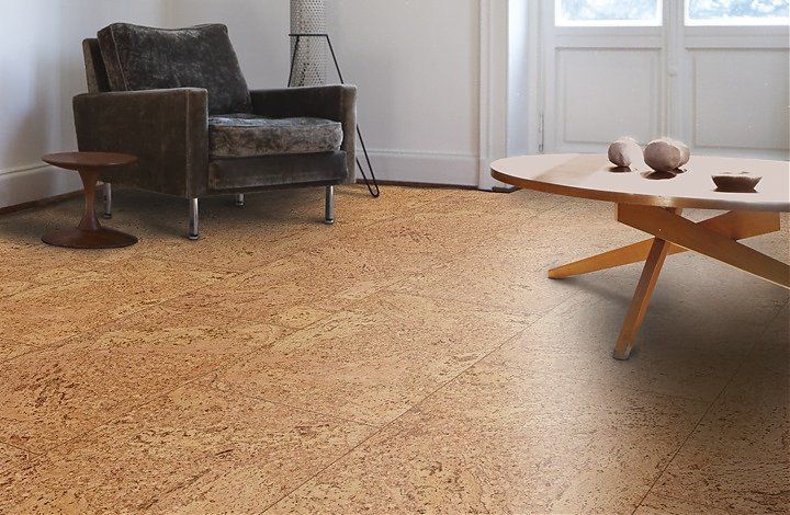
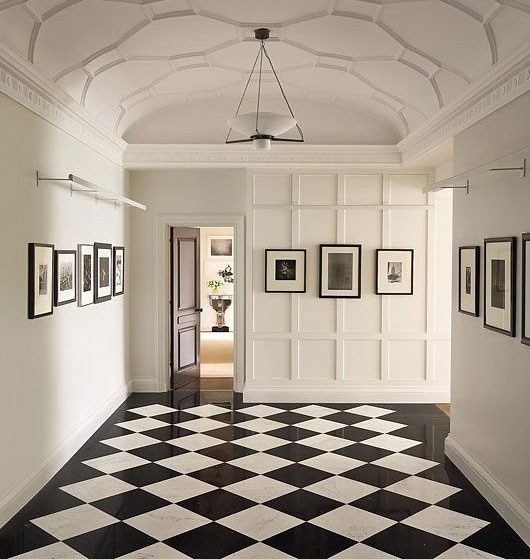
I am having difficulties deciding on how to proceed with my flooring.  I have a fairly small house and am planning on putting cork flooring in the living and dining rooms, which basically run along one side of the house.  I had thought to put a great black and white patterned tile in the front entryway and kitchen, which runs along the other side of the house.  The two flooring types would meet at the doorway between the dining and entry and also at the doorway between the living room and kitchen.  Would this be too busy, since the cork I want to choose is Wicander's Accent and has a lot of pattern to it?  Should I just go with the cork throughout the entire house to make it feel larger and more cohesive?


Thanks, 

Molly

Hi Molly, 


I would say it depends on the size of your home, and the size of your transitions.  If you have a home that is under 2000 sf, (on a given level) I'd really try to keep it the same flooring.  If your home is larger, I'd be more likely to have multiple floor surfaces.  

I try to keep my floor transitions to the width of a doorway.  If you are referring to changing floors in a doorway, especially if there is actually a door, go ahead and change the surface if you'd like.  I am not a fan of large open floor transitions.  

Also be careful of height differences in materials that can create possible trip hazards.  Tile could be significantly higher than cork if you are on a raised foundation.

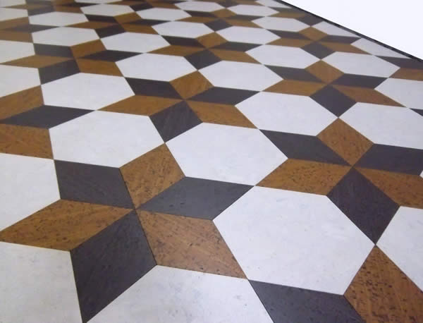
When I read your question, my first thought was to trasition a solid natural color cork with black and white cork.  This is a more organic transition, and would work well, even in a smaller home.  You can purchase cork in these colors, or if you are having your floor finished on site, they can be painted before the urethane goes down.  (the floor below is still cork)

You could also do a patterned stencil on your cork floors in certain areas if you like.  You could also transition in your areas you were considering tile to a more subtle two tone cork checkerboard pattern.  Or, you could use your natural cork color checkerboarded with just white or just black.


Good luck Molly- thanks for writing in!

- Christine


Melissa's Exterior

$
0
0
Christine, 
I need help chosing colors for my home.  I am considering painting the brick front...but no sure how it would look.  Any suggestions you can give are greatly appreciated.
Please see attachment below, which i hope include pictures :0)
Thanks in advance,
Melissa
Hi Melissa, 
If it were me, I would not paint it.  Why?  (I know, sometimes I tell people to paint it, sometimes I tell them not to).  I use a couple of guidelines.  
1.  Is the brick helping or hurting the architectual balance of the home?  
In your case, it helps.  Your exterior is nicely balanced.
2.  Is the brick a good-looking brick?  
In your case, I'd say your brick looks great.  
So- I wouldn't change your brick, but I would change almost everything else.  ;-)   I would extend the front step area to be larger.  Make your entry more dominant.  Add a more welcoming front door., and improve landscaping leading to the door.    To further improve your curb appeal, I would replace garage doors and increase the "presence" of the small window over the garage. ( I find it to be a little awkwardly small.)  Increase the width with shutters, and the length with a window box.  I would consider shutters on your other windows as well.  If the expense of replacing the garage doors is not in the plans, perhaps you can simply replace the windows and add "carriage house style" hardware to your existing doors.
As far as colors go, you have a black roof, so repeat that in your front door and shutters.  You have white windows.  I'd repeat that in the trim.  As far as your field color goes, I would either lean beige, gray or more white.  From there, it's really more an issue of personal preference.  A couple to consider are SW7641 Collonade Gray, or SW7642 Pavestone.  I will say that there's nothing that I "don't like" about your existing color, but I do appreciate wanting a change, if that's what you're looking for.  I'd get sample quarts and make sure they look nice next to the brick.  
Thanks for writing in!
Christine


Custom Rugs for Beth

$
0
0

Hi Christine! 

I love your blog, and I am in dire need of real world mom carpet design advice (not salesman!) for my 1st floor.  I have Ben Moore edgecomb gray paint on my 1st floor, and I need custom size rugs for my living room, dining and fam room bc they are all odd sized rooms.  I want neutral color rugs that all flow together since i am using pillows , wall art , plants etc for color.  I love Masland carpets too - but how do I choose what goes together / flows well?  Should I get 3 rugs all the same? 3 different patterns? How light /dark in color should I go?   What styles are more fam room vs living room appropriate?  In an ideal world, wool or nylon?  Any help would be much appreciated.
Looking forward to your practical yet always stylish advice!
Sincerely
Beth


Hi Beth, 

There are a lot of ways to approach this, but I will give you my "if it were me" answer.  I would use different rugs in each room.  You can do this and still keep them incredibly neutral, like you mentioned you were going for.  When I am combining three different rugs, I like them all to look great together, but they don't need to "match."  I like using a variety of textures.  Different 


here's an example:


Sisalrugs.com- kenya Sisal in Nickel  (comes in custom sizes)


Moor Rug, by Capel- in Stone (comes in custom sizes)


Pebbles by Capel- (available in custom sizes)


I love Masland, but also consider Capel- they have a large selection of area rugs that you can have in custom sizes.

You Tube Channel

$
0
0

I started a little You Tube channel.  I was going to have 50 videos by Christmas.  It is now 5 months later, and I only have three.  Here they are though!  


Shawna's Exterior

$
0
0

Hi Christine,

I love your work and I saw that you offer help with design decisions so here goes.
We would like to update the exterior of our home. The roof lines of our home are lovely.  The aluminum windows are a little busy with the amount of muntin bars, although I do like muntin bars (but less). There seems to be a lot of textures on our home so I'm leaning towards tone on tone and painting the brick with a transparent paint (same color as the body) to minimize the busyness of the windows etc. However I'm not sure how white windows would work with that. No idea what colors to choose. FYI , our roof is black with a slight blue undertone. Maybe (although costly) would be to purchase new windows and take off the Tudor lines then re stucco to make thicker nubby stucco, new trim, paint, and an iron window box on the middle upper window. In that case should we choose black windows with cream trim and a light color body or a tone on tone paint scheme and windows custom painted in the trim color? I'm tired and confused and my husband is right, I can't make a decision! Help!

We have renovated the inside and have leaned towards sort of a restoration hardware monchromatic beachy look.

Could you be so kind as to provide us with two choices:
1. quick fix, ie., Paint colors.
2. And an ideal more costly choice, new window color and paint colors for body and trim.

This pictures shows the color of the brick and a close up of the windows.

Thank you so very much for you time and expertise.

Shawna

Hi Shawna, 

For a more contemporary, less busy, updated look, let me share with you a few changes.

1.  A less busy look, with paint changes only, will come with more subtle paint colors.  I would start with lightening the brick.  Until you do that, it is prematuire to select actual paint colors.  There are different ways to limewash.  Keep in mind that, for now, you have white windows.  Go for a finish on the brick that will look good with the white windows.  (Of course if you choose to replace windows- you can have more flexiblity.) After the brick is done, then select the paint colors.  Here, again to create a less busy feel- go for low contrast.  Look at the photo above- a lighter field color, with a slightly darker trim color, and coordinating, but light and subtle brick color.   


2.  If you go with a more expensive route, yes, removing the boards is a great start.  I would go with a more smooth stucco- not a more rough one.  I prefer the more sophisticated look of a smoother finish with your type of architecture.  


3.  if you replace the windows, I would go with black.  They look 100 times better with a light stucco than white windows.  


4.  Updated garage doors will be another great step.  


Karen's Exterior

$
0
0

Hi,

I came upon your blog when I typed in “painted brick houses” and I’m so happy!  This is a picture of a house I just purchased as a newly divorced gal.  I’ve always dreamed of  living in a cute painted brick house and after 28 years of marriage ending, I may just have it!  Right now, this house is just sort of….sad.   It has potential to be eye-catching, I believe, with the right colors.  I plan to add shutters  and a flower box under the windows.  I’m also thinking of having posts on the front porch rather than the wrought iron because it looks dated to me.

I’ve looked at suggestions that you’ve given from the Sherwin Williams colors (Relaxed Khaki, Universal Khaki, Stone Lion, etc…), which has been helpful.  I also saw a comment that three colors are better than just two.  I guess I’m wondering if I should have the brick painted one color and the bottom stone part different?  If you could make suggestions of colors for this little charmer, I’d appreciate it greatly.  The neighborhood is pretty traditional…nobody has gone out on any limbs, so I guess anything “risky” is out (even though I would love it).  I’m also not a fan of grey/black combinations.  

Thanks for your time and no real hurry!

- karen

Hi Karen,

Let me start by telling you that you have a charming home.  Now let me tell you how to make it more charming.  

1.  Improve the roofline

2.  Strengthen the entry

3.  UPdate the dated

4.  Improve proportions visually

OK- starting with #1.  Your house it so cute, but the roofline leaves something to be desired.  it reminds me of a little triangular hat.  

Ok- maybe not exactly like that one- but what post isn't improved with a picture of Poldark?  Karen- if you haven't watched this show- I will just say- "You're welcome" for telling you about it.

I would do this by adding a triangular pediment to the front.  This improves your roofline without touching your roof- just adding the entrance.  I'd be generous with it as well
This also leads us to #2- strengthen the entry.  Look at your house straight on.  Instead of the entry being charming and inviting, you can only see half of the door, the bottom is covered by a bush and dated metal railing.  Like the robot bartender in Passengers- it's missing something.  A charming front door does SO MUCH for an exterior.  This is supposed to be the focal point on a house like yours.  I know that storm doors are practical.  I used to live in freezing windy Iowa.  But the designer in me would want to ditch it.  ;-)  
#3- Update the dated.  You mentioned this already- and I agree with you- but would do it a little different.  What I consider dated is basically the door and the metal railing.  Don't get rid of the railing idea altogether, I'd switch the metal to wood, after you open up the door, there is still a little porch space.  A wooden porch railing will add to the charm of your little charmer.

#4- I'd improve proportions.  You were already on track with this in your letter.  Where I see this to be an issue is mostly in two places.  The window on the right is small.  If your budget is generous- add a larger window.
 

I know this gets complicated on a brick home, which translates to expensive.  And so- of course- there are ways to increase the size visually without increasing it physically.  I'd do this with shutters and a window box.  All of the sudden it will look wider and lower, and more super cute.  The frieze board is also small.  Increasing it's size will ramp up the charm factor.

Oh ya- you asked about paint colors huh?  Here's a little warning to all of you gray lovers out there.  Colors don't tend to be super popular for more than 7-10 years, and gray has already been enjoying popularity for about 5.  So- if you want to love this exterior paint job for more than 3-5 years- don't paint it a trendy color gray.  Closer to the beginning of the trend it might have been worth it- but painting brick is more complicated than painting siding.  It is very absorbent, sucks up a lot of paint.  It's an intense process.  You want it to last for a long time.  I would paint it a shade of white.  You can add lots of personality with your paint selection on the door and shutters.  You can have the field color be creamier, like simple white, 7021, and the railing, pediment, and other architectural trim in 7004 snowbound.  Your shutters and front door can be in black, a robin's egg blue, or a subtle Magnetic gray.  Is that a trendy color- sure it is, but re-painting a small area like that is not the expense and project that the entire home is.  


Thanks for writing in!

- Christine


Viewing all 132 articles
Browse latest View live